Pixel-Perfect React Components: Our Quality Assurance Process
What Does "Pixel-Perfect" Actually Mean?
The term "pixel-perfect" is used so loosely in frontend development that it has nearly lost its meaning. Some developers use it to mean "roughly matches the design." Others interpret it as "identical to the static mockup but only at one screen size." Neither of these is what the term should mean in a professional Figma-to-code conversion.
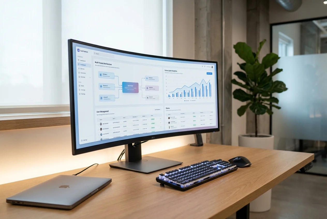
For us, pixel-perfect means: the rendered component, at every specified breakpoint and in every specified state, is visually indistinguishable from the Figma design when viewed side by side. Spacing matches. Typography matches. Colours match. Alignment matches. Animations match the specified curves and timing. And this fidelity is maintained across Chrome, Firefox, Safari, and Edge on both desktop and mobile viewports.
Achieving this level of fidelity is not primarily a development challenge — it is a quality assurance challenge. Building a component that looks right in one browser at one viewport width is straightforward. Ensuring it looks right everywhere, in every state, and continues to look right as the codebase evolves — that requires a systematic QA process. This article describes ours.
Phase 1: Figma Overlay Comparison
The most direct way to verify visual fidelity is to overlay the rendered component on top of the Figma design and look for differences. We use a semi-transparent overlay technique that makes even sub-pixel misalignments visible:
- Export the Figma design at the target viewport width as a PNG at 2x resolution
- Capture a screenshot of the rendered component at the same viewport width, also at 2x resolution
- Overlay the two images with the Figma export at 50% opacity
- Inspect for misalignments in spacing, typography, colour, and element positioning
This process is performed at every specified breakpoint — typically 375px (mobile), 768px (tablet), 1024px (small desktop), 1280px (standard desktop), and 1440px (large desktop). Any discrepancy greater than 1px triggers a fix-and-recheck cycle.
For components with multiple states (hover, active, disabled, loading, error, empty), we perform the overlay comparison for each state individually. A button that matches the Figma design in its default state but drifts by 2px in its hover state is not pixel-perfect.
Phase 2: Visual Regression Testing with Chromatic
Overlay comparison verifies that the component is correct at a point in time. Visual regression testing verifies that it stays correct as the codebase evolves. We use Chromatic (the visual testing platform built by the Storybook team) to capture baseline screenshots of every component and flag visual changes on every pull request.
The workflow:
- Every component has Storybook stories covering all variants, states, and representative data scenarios
- Chromatic captures screenshots of every story across multiple viewport widths
- When a pull request is opened, Chromatic compares the new screenshots against the approved baselines
- Any visual change — intentional or accidental — is flagged for review before the PR can merge
This catches a category of bugs that manual QA consistently misses: indirect visual regressions. A developer changes a shared spacing token and inadvertently affects twelve components. A CSS specificity change in a parent layout shifts the alignment of nested children. A font loading strategy change causes a flash of unstyled text. Chromatic catches all of these before they reach production.
Phase 3: Responsive Spot-Checks
Automated visual regression testing covers specified breakpoints, but real users view applications at arbitrary viewport widths. Between 375px and 1440px, there are hundreds of possible widths where layout might break — text wrapping unexpectedly, elements overlapping, flexbox calculations producing fractional pixels that round differently across browsers.
We perform manual responsive spot-checks using browser DevTools' responsive mode, slowly resizing the viewport from mobile to desktop and watching for layout anomalies. This catches issues that breakpoint-based testing misses:
- Text that wraps at 412px (common Android width) but was only tested at 375px
- Horizontal overflow that appears at 820px (iPad in portrait) but not at 768px
- Navigation items that collide at viewport widths between the mobile and desktop breakpoints
- Images that stretch or compress at intermediate widths where no specific sizing rules apply
Phase 4: Cross-Browser Verification
CSS rendering is not identical across browsers. Flexbox gap calculations, subpixel rendering, font rendering, and scroll behaviour all vary between Chrome, Firefox, Safari, and Edge. Our cross-browser verification process covers:
- Chrome (latest): Our primary development browser and the baseline for visual comparison
- Firefox (latest): Different font rendering engine, different subpixel rounding, different scrollbar behaviour
- Safari (latest on macOS and iOS): The most common source of CSS bugs — Safari handles viewport units, flexbox, and position:sticky differently from Chromium-based browsers
- Edge (latest): Generally matches Chrome behaviour but we verify regardless, particularly for enterprise clients where Edge is the mandated browser
- Safari on iOS: Mobile Safari has unique viewport behaviour, rubber-band scrolling, and input focus handling that require specific attention
Phase 5: Performance Budgets
Visual fidelity at the expense of performance is not acceptable. Every component is measured against performance budgets before it passes QA:
- Bundle size: Each component's contribution to the JavaScript bundle is measured. Components that exceed their budget are reviewed for unnecessary dependencies or code that could be tree-shaken.
- Render performance: Components are profiled using React DevTools to verify they do not cause unnecessary re-renders. Components in lists or frequently-updating contexts are tested with representative data volumes.
- Animation frame rate: Animated components are profiled to verify they maintain 60fps on target devices. Animations that cause layout thrashing or excessive paint operations are refactored to use compositor-only properties.
- Core Web Vitals impact: Components are tested for their impact on Largest Contentful Paint, Cumulative Layout Shift, and Interaction to Next Paint. Components that negatively impact these metrics are optimised before delivery.
Phase 6: Accessibility Verification
Every component undergoes automated accessibility scanning with axe-core (integrated into Storybook) and manual verification of keyboard navigation, screen reader announcements, and colour contrast. Accessibility issues are treated as bugs with the same severity as visual discrepancies — they block delivery until resolved.
The Outcome
This six-phase QA process typically represents 20-25% of the total project timeline. It is not overhead — it is the difference between components that look right in a demo and components that work correctly in production across every browser, device, and viewport your users actually use. The investment in QA pays for itself in reduced post-launch bug reports, faster design iteration cycles, and engineering confidence that changes to one component will not break others.
If you need Figma designs converted to production code with rigorous quality assurance, book a free consultation. We will review your designs and explain how our QA process applies to your specific project.
 End-to-End Custom Solutions
 Business Process Web Apps
 API Modernisation